Have you heard of microcopy? If not, you might be missing out on opportunities to connect with and guide your audience.
What is microcopy?
Microcopy refers to small, short pieces of text that are usually used on a website or app to give guidance, instruction or clarification as you navigate through. It’s generally copy that’s used after a product or service has been sold, to make it easier to use and understand.
You’ll sometimes find it on product packaging too, either as an instruction, or to show off a brand’s personality and tone of voice – some brands use microcopy to add a little humour into things.
Some types of microcopy that you might spot:
- Error messages
- Loading messages
- Instructional text
- Onboarding and offboarding copy
- Success messages
- Tooltips and hover-over text
- Text fields in online forms
- Alt text
- Notifications
Microcopy is often underutilised or forgotten, leading to confusion or miscommunication with your customer. Don’t just assume they know what they’re doing – take the time to look at your audience’s user journey as if you don’t know anything about your brand. Is there anything missing?
Overall, microcopy makes it easier for people to use a product or service, reduces irritation in the process and is strongly related to the actions that a user takes. It can even have an effect on conversion rates.
While it isn’t some magic fix that’ll send your business skyrocketing, it is something that can make a big difference to your customers.
Examples of beauty brand microcopy
Here are some examples of beauty brands that are using microcopy on site, along with how they’re using them and why.
Charlotte Tilbury
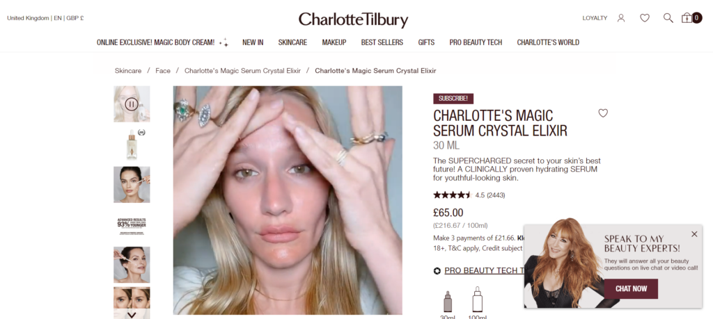
Charlotte Tilbury uses microcopy all across their site to give product and application guidance. But what caught my eye was the box on the bottom right hand side that says “Speak to my beauty experts! They will answer all your beauty questions on live chat or video call!”
Now, I’m not mad on the number of exclamation marks in that microcopy but, the whole thing’s very on-brand and it’s instructional, useful and clear on what to do and why you’d bother.
Fenty Beauty
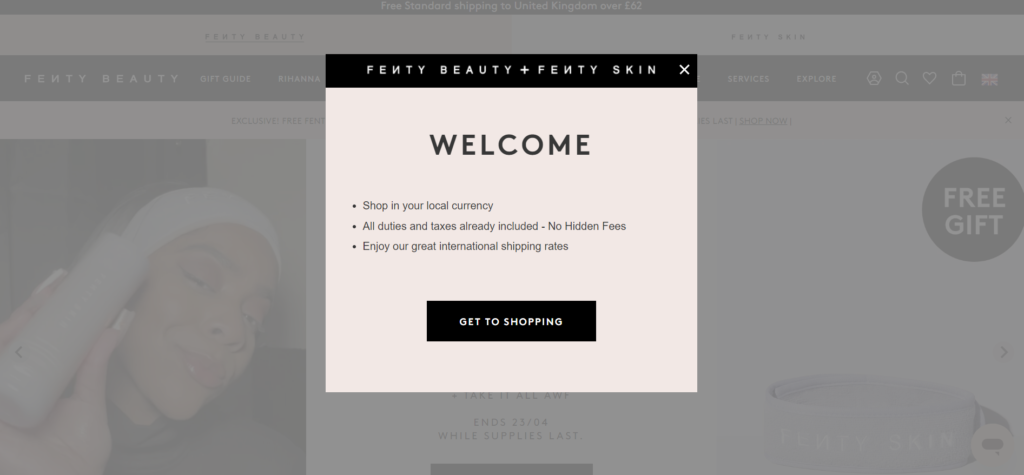
Known for their inclusive shade range and their tone of voice that sounds like Rihanna runs the entire business completely alone, this isn’t the most exciting thing that Fenty Beauty have ever said.
However, it’s a good example of instructional microcopy that clarifies some key info before you start to shop. This helps take confusion or concern out of the process – which definitely can happen when it comes to currency and international shoppers.
Luxy Hair

This example from hair extension brand Luxy Hair clarifies what each of their different categories actually mean. This makes it clear and manages expectations for customers and allows them to make an informed decision on what’s best for them. Plus it gives them a comparison point for other hair brands.
Some things that might seem obvious to you (as a business owner or marketer) might not be so for your customers, so make it clear with a little touch of microcopy.
Nails Inc

Email newsletter sign up text is nothing new, but see how Nails Inc have included some microcopy in the box where you input your email? This makes the benefits of signing up clear and acts as a further push to do it for the 10% discount.
It’s more interesting than just saying “email address” anyway, though you could argue that that’s actually even clearer in terms of microcopy.
REFY
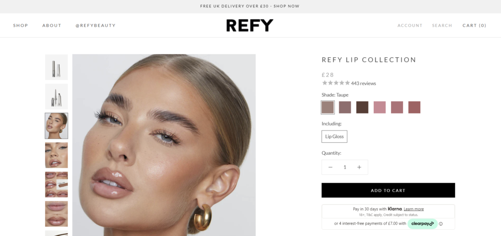
You can tell from this image (seriously all of the beauty shoots that this brand do are absolutely gorgeous), but REFY use alt text on their images to make it clear what the products are and what each image shows.
This is also useful for people who use screen readers or if the image can’t display for whatever reason. It’s also essential for SEO, as search engine crawlers work out what they’re looking at based on the alt text.
Typology
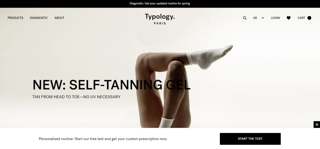
The text in the top and bottom bar of the Typology website are both examples of microcopy. They’re clear, instructional and add value to the audience by encouraging them to discover a personal routine that works for their routine.
It’s short and to the point but it definitely helps to steer the user in the right direction, whilst giving them guidance and generating product awareness further down the line.
Lush
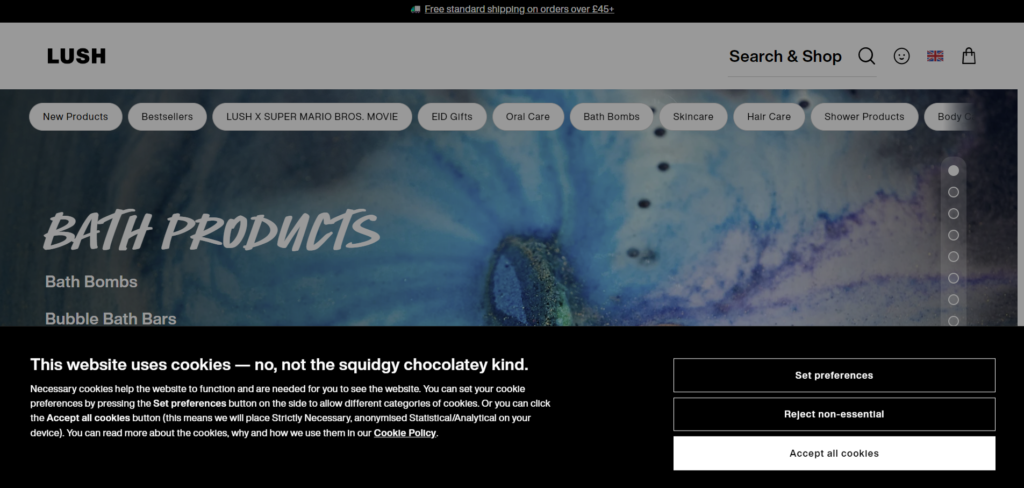
Everyone hates the cookie pop ups that appear on every single UK website, but Lush have at least tried to add a little personality into it with their microcopy that clarifies that they’re not talking about the fun, edible type of cookies.
It’s a good example of them getting their approachable, friendly brand voice across whilst still meeting the requirements of telling people that cookies are active on-site. It’s as a cute as this pop up is going to get realistically.
Tips for writing microcopy for your beauty brand:
- Take the time to follow your user journey as if you’re a customer who knows nothing about your business (or get someone else to) and take note of any steps that are clunky or confusing.
- Be clear and concise – it’s called microcopy, so it needs to be short and to the point. You can also use a more conversational tone to make it easier to understand.
- Make sure it adds value. While most microcopy is helpful, you don’t want to do the digital equivalent of leaving 100 instructional post-it notes behind you when you lock the door.
- Don’t be scared to add your brand tone of voice and personality in there.
Need help with microcopy for your beauty brand?
If you’re currently writing (or re-writing) the content for your beauty brand, I can help. Get in touch with me and I can help you create microcopy for your website, so you can focus on the rest of your brand.

